Polligarden
Cultivating a new wave of sustainable gardeners
Role
Product Design
Research
Design System
Prototyping
collaborators
Product Designer (1)
Tools
Figma
Illustrator
After Effects
Spark AR
Timeline
Jan 2023 - Apr 2023
View prototype
Context
Pollinators are essential to our biodiversity and food production. Derived from conversations about sustainability and a mutual love for gardening, Liqi and I partnered up to imagine design as an agent for environmental change.
Problem
Despite efforts to create green spaces within the cityscape, beginners are challenged by the various learning curves and lack of rapport when starting their gardening practice.
Solution
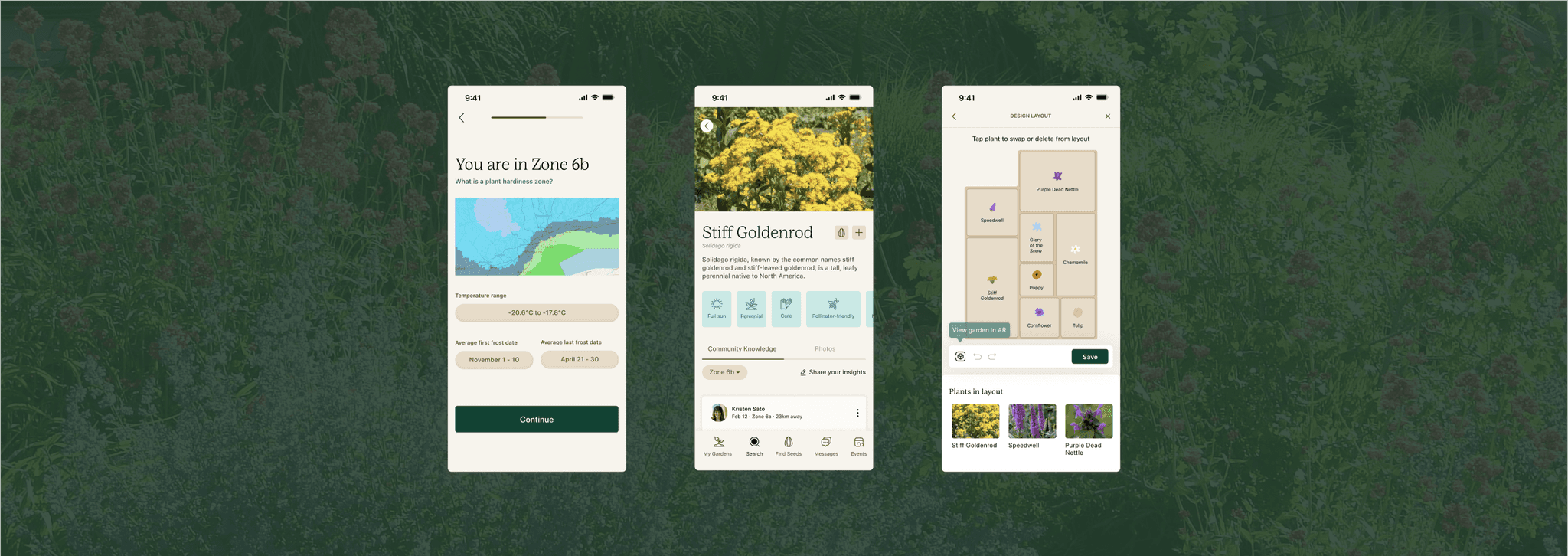
A mobile app that alleviate the barriers to entry by connecting beginner gardeners to resources, mentors, and local events. Beginners gain access to a wealth of information on gardening techniques, plant care, as well as a supportive community of fellow gardeners who can offer advice and guidance.
"How might we encourage more Torontonians to start their own pollinator garden?"
Solution
Highlight reel

Discover
Research methods
👁️
Competitor Analysis
Examined features from top 4 gardening apps.
📝
Surveys
Asked 99 participants about their current habits & pain points.
🗣️
Interviews
Spoke to 5 participants for in-depth discussions about their gardening experience.
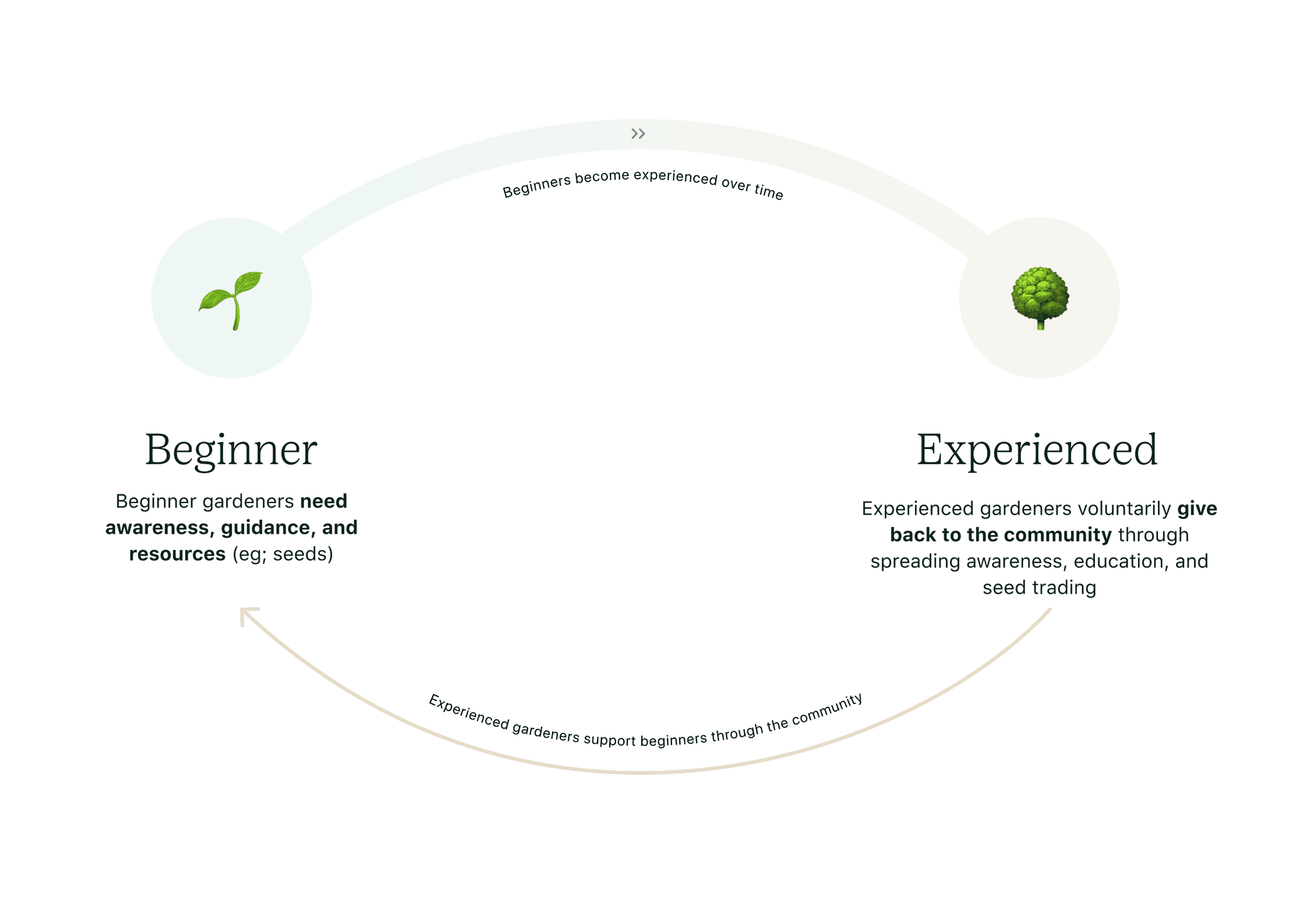
System map
In the current ecosystem, beginners rely on self-studying to build up gardening knowledge, while experienced gardeners lack conduits to share their resources.
What if there was a way to build rapport and mentorship from the very start by highlighting the resources available across the community?
Barriers for beginners
🐝
Unaware of pollinator gardening
People often feel uncertain in their understanding of pollinator gardening, causing hesitation in getting started.
😣
Overwhelmed by garden planning
Beginners are tasked with extensive amount of research, fact-checking, and testing before breaking ground.
🌱
Unable to source native pollinator-friendly seeds & plants
Finding good quality seeds (& plants) that are native to the area poses a challenge.
🤔
"How might we connect beginner gardeners with resources & mentorship to overcome the challenges in starting a pollinator garden?"
Design requirements
To alleviate the pain points reported from beginner gardeners, we derived features to help beginners with their gardening journey.
Garden Planner (& ability to save different configurations)
Sourcing seeds
Community page
Plant recommendations
Instructional content
Plant care reminders
Design time
Conceptualizing
I used sitemaps & low fidelity frames to determine how the features consolidated into one coherent flow. I considered how the users would navigate from the initial onboarding to ultimately ending the experience, feeling confident about their garden plan.
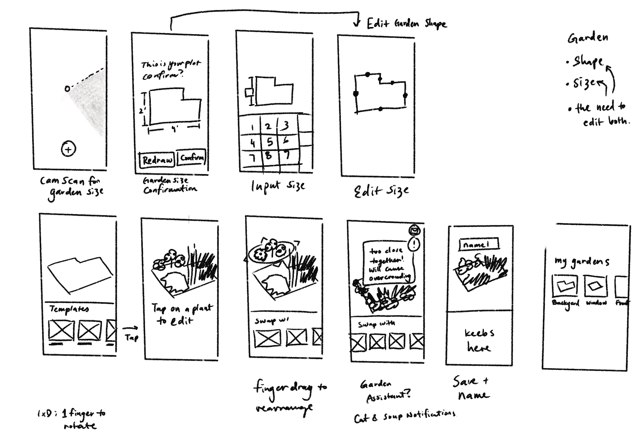
Initial lofi frames for Garden Planner
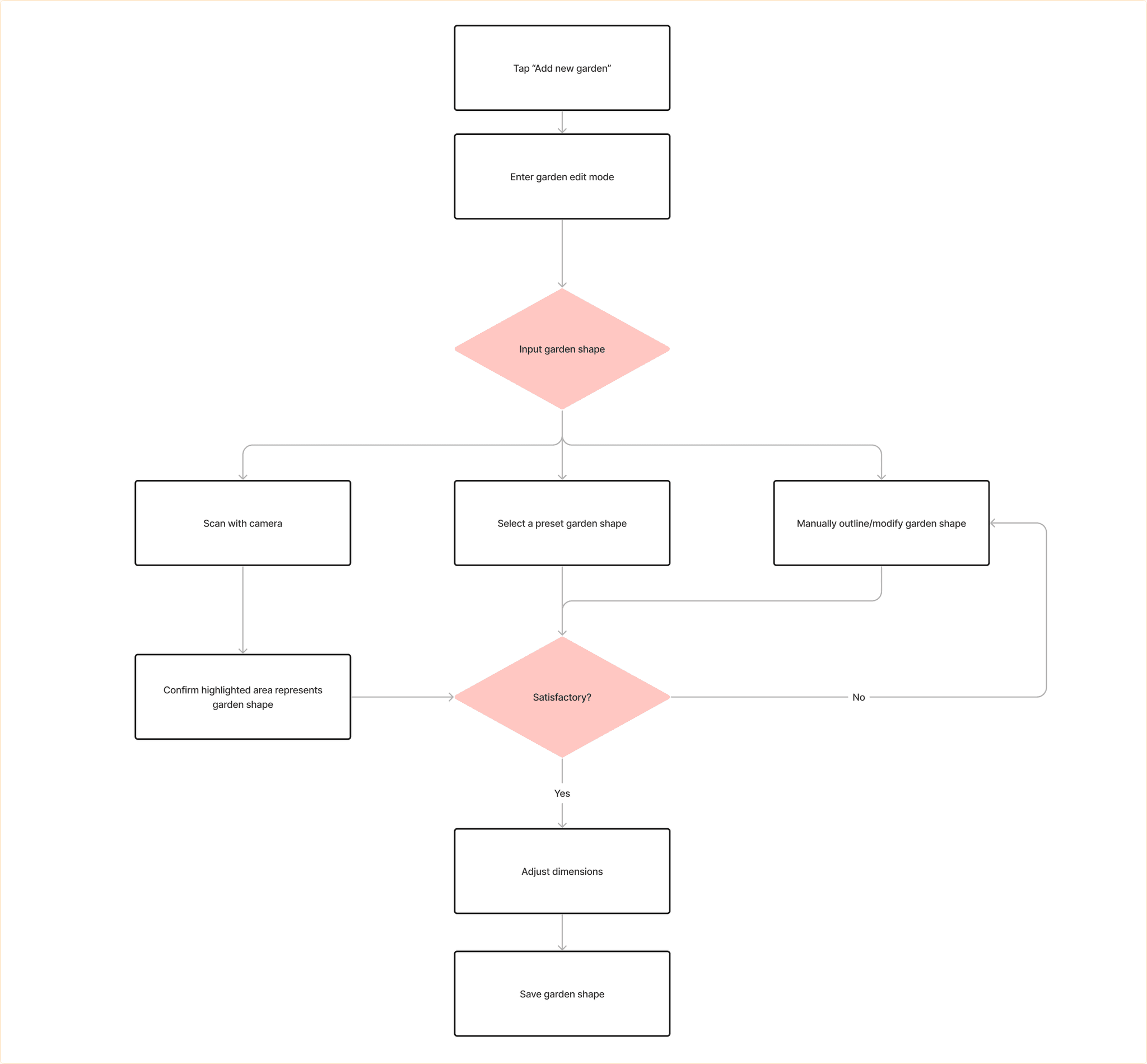
Userflow for starting a new garden
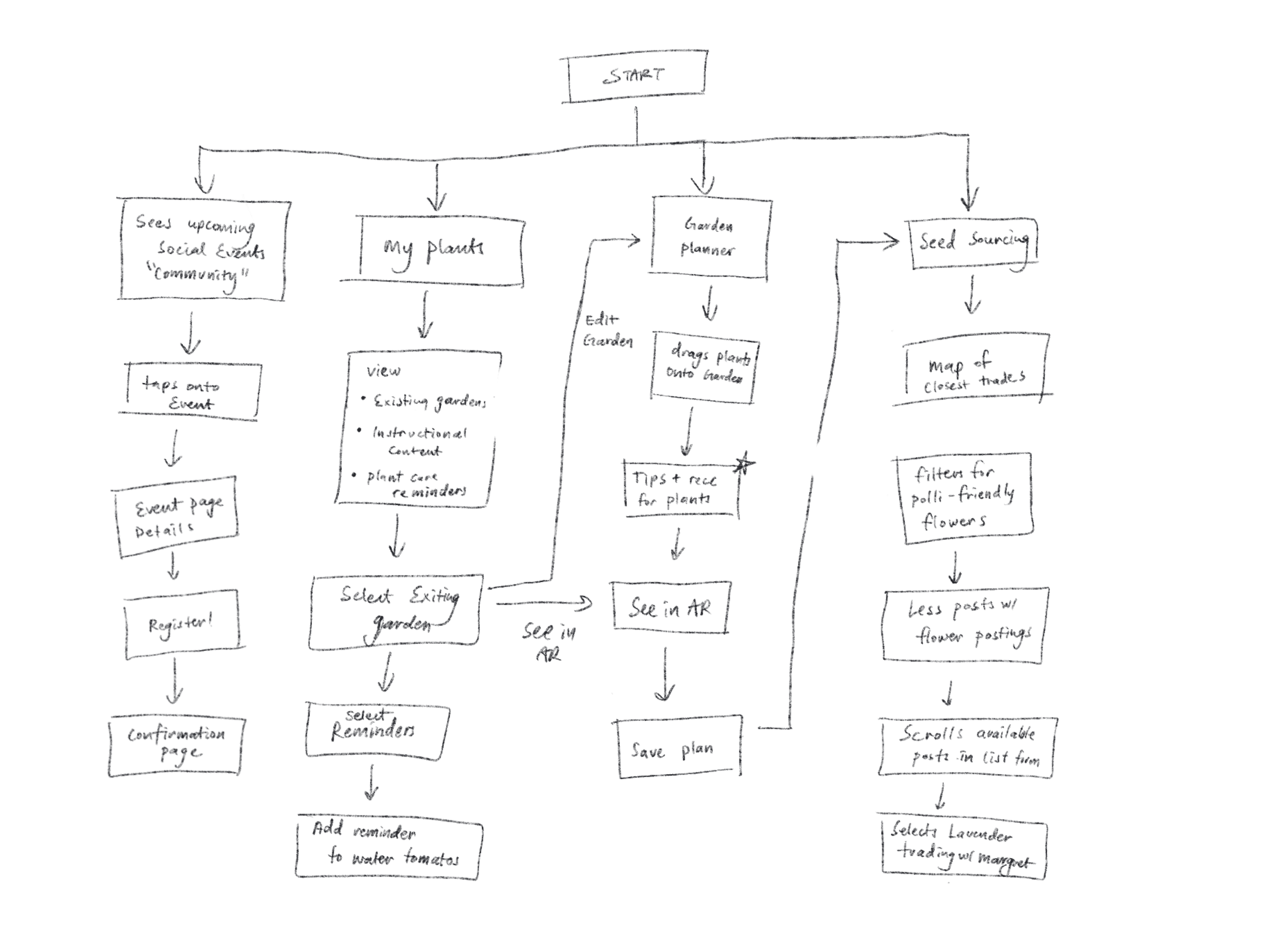
Sitemap to establish information architecture of the app
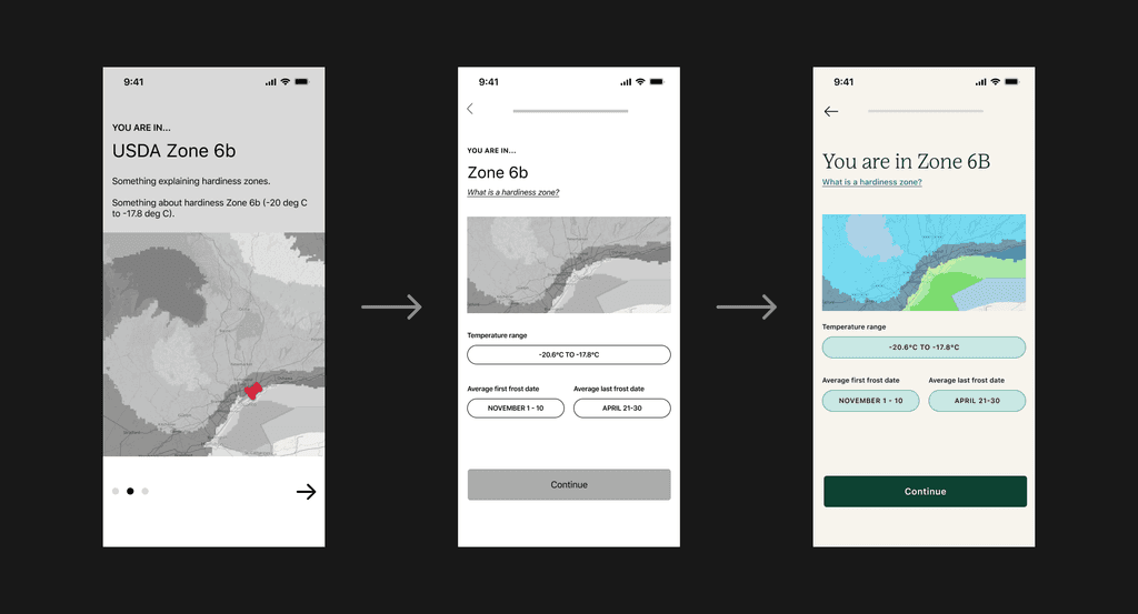
The design evolution
At each level of fidelity, various options were tested and iterated upon to ensure an intuitive, usable, and seamless user experience.
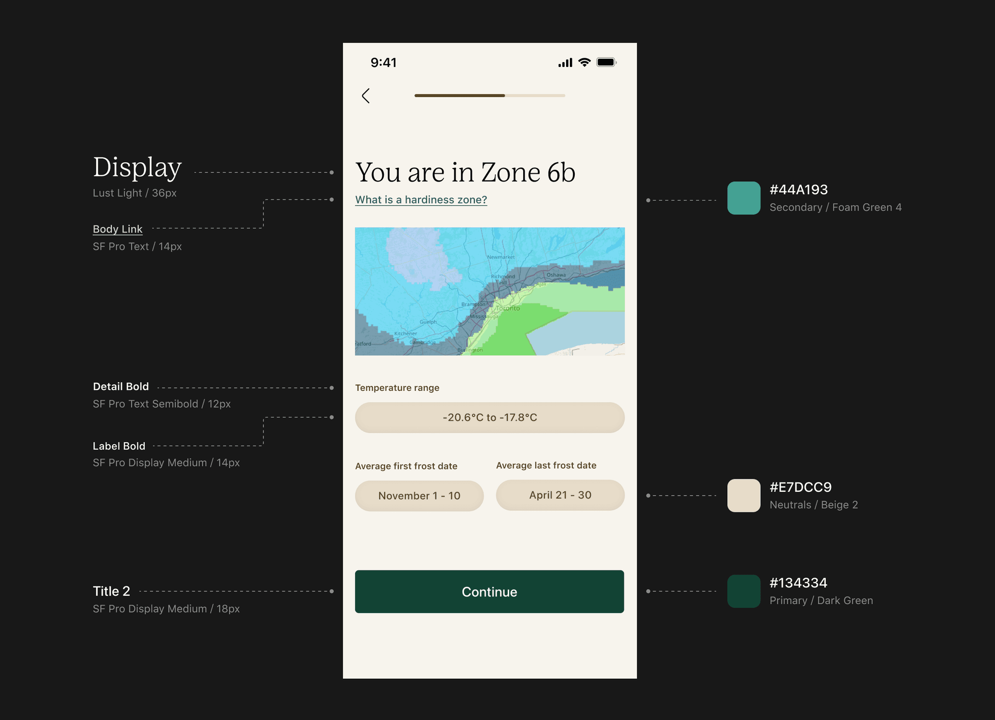
Crafting a voice of compassion
The style guide was created to emanate the warmth of a mentor, gently guiding users along their gardening journey. The app carries a comforting and accommodating tone of voice, providing an educational and helpful experience for both novice and experienced gardeners alike.
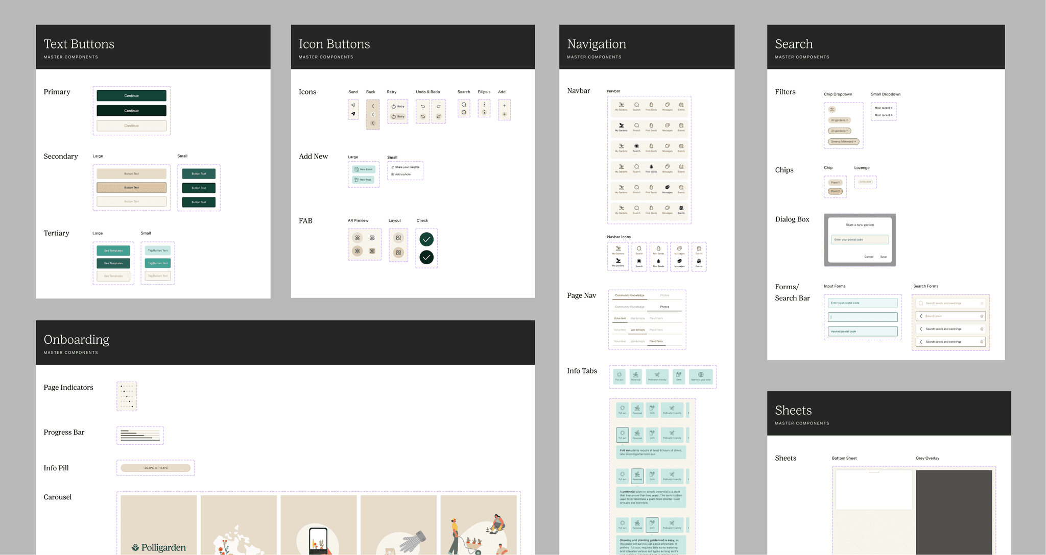
Creating a scalable system
Extending the style guide, I created a versatile family of flexible and interactive components that maintain visual coherence and enhance readability on mobile devices.
Final designs
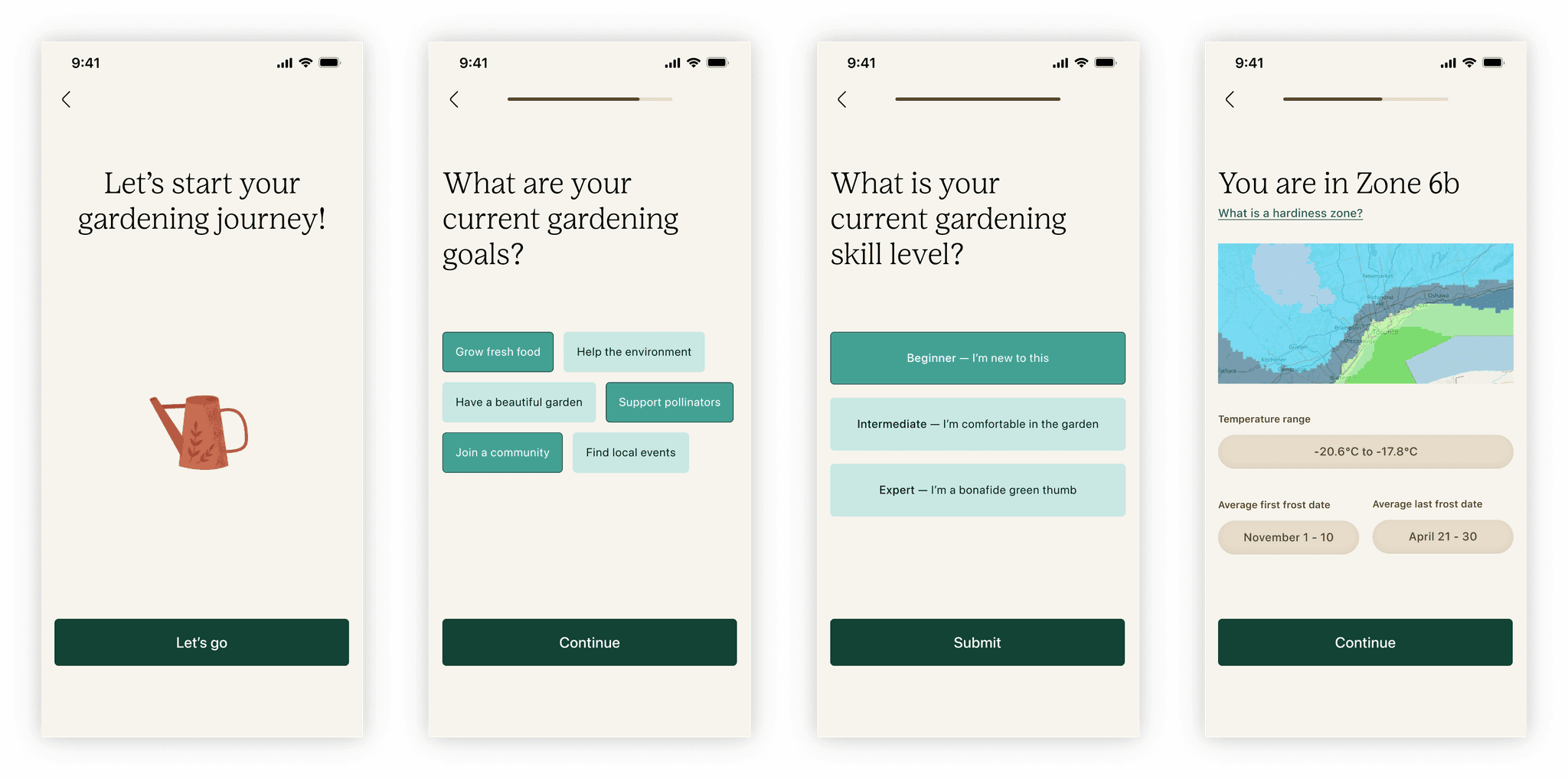
Below are some selected high-fidelity mocks utilizing the design system, representing a seamless flow between the various feature areas.
Reflection
A look back
Unblocking challenges together
For this project, I worked closely with my design partner Liqi to produce the MVP. Though we ran into tricky situations regularly throughout our collaboration process, I learned to communicate openly about my assumptions and struggles to navigate challenges without judgement. In the end, we were able to weave our ideas harmoniously together, ensuring a seamless user experience.
Scaling ideas left behind
This explorative project was intended to be a vision statement. Thus, there were ideas deprioritized in favour of user value and scope control. If given the chance, I would further develop features that cater to our secondary user group of experienced gardeners.
Reflection
A look back
Unblocking challenges together
For this project, I worked closely with my design partner Liqi to produce the MVP. Though we ran into tricky situations regularly throughout our collaboration process, I learned to communicate openly about my assumptions and struggles to navigate challenges without judgement. In the end, we were able to weave our ideas harmoniously together, ensuring a seamless user experience.
Next steps
Scaling ideas left behind
This explorative project was intended to be a vision statement. Thus, there were ideas deprioritized in favour of user value and scope control. If given the chance, I would further develop features that cater to our secondary user group of experienced gardeners.
Thanks to
Liqi Zhong, for sharing this lightbulb moment and for partnering with me on this project. I learned so much about visual design and teamwork from our time together!
←
Derma Relief
SAP
→

A warm welcome
Discover your hardiness zone and receive personalized and localized guidance
Garden planner
Plan and test garden designs based on your needs and preferences
Visualize in AR
See your garden plan come to life in real time
Seed sourcing
Find what you need through community exchanges
Learn about different plants
Access localized insights and information based on your climate
Join events near you
Get involved in the local gardening community with workshops or volunteering